An app design to enhance community engagement for Willy Street Co-op.
Role
UX/UI Design
Scope
10 Weeks
Tools
Figma
Canva

Error 504: Missing Co-op Connect!
The Problem:
Willy Street Co-op, a customer-owned cooperative grocery store, aimed to boost member engagement and emphasize cooperative values.
However, its current website:
-
Lacked sufficient community interaction space.
-
Impacted its capacity to attract new owners.
-
Hindered its ability to uphold cooperative principles effectively.
My Objective:
To create a user-friendly digital solution that encourages community interaction and ensures clarity of information.
A Problem Deep Dive
Research Methods:
-
Analyzed user feedback from Google, Instagram, and Reddit.
-
Utilized website analytics and feedback forms.
-
Examined competitors' platforms for trends and opportunities.
Identified Pain Points:
-
Limited recipe interactivity: Users desire features for questions, feedback, and suggestions.
-
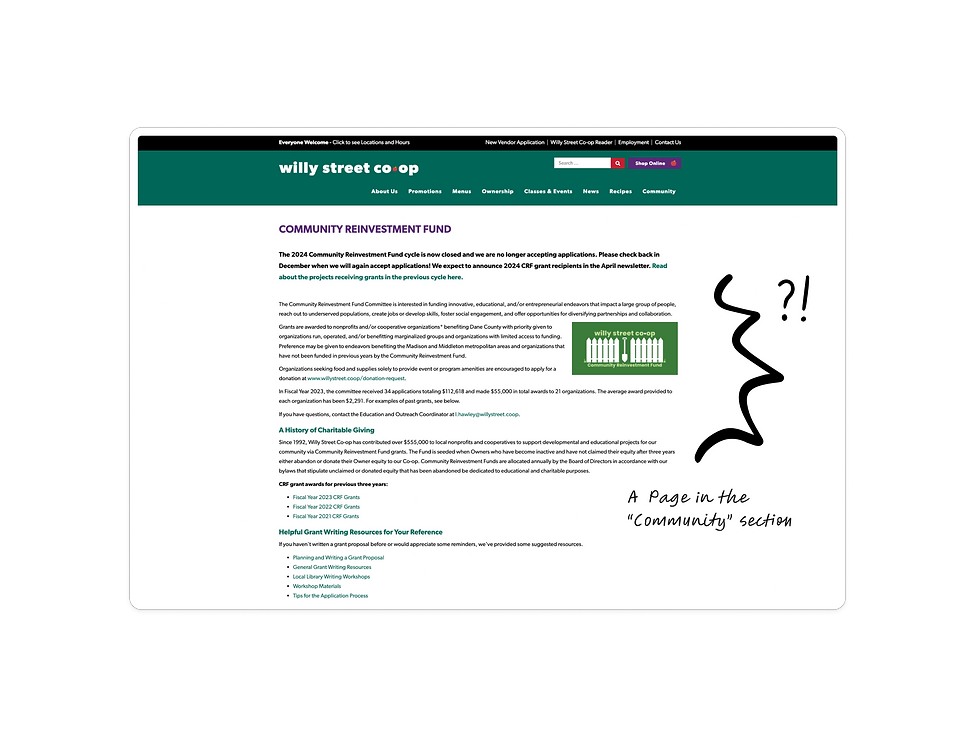
Static community tab: Lacks interactive content, primarily displaying donation and reinvestment fund information.
-
Disconnect from cooperative values: Users feel disconnected due to a lack of educational resources and transparent communication.
The research highlighted the need for urgent improvements in the digital platform to enhance interactivity and align with cooperative values.


How Might We....
Enhance Willy Street Co-op's digital presence to attract more owners, deepen cooperative interest, and raise awareness about its values?
Exploring Ideas
-
I explored multiple solutions based on the HMW statement, grouping them by themes like user engagement and community involvement.
-
Three standout ideas emerged:
-
Interactive cooking classes
-
Mobile app for exclusive benefits
-
Community Hub section
-
After careful consideration, the Community Hub for Member Engagement emerged as the most promising solution, addressing the need for increased engagement and effectively targeting owners' pain points.
Features aimed to be included:
-
Forums for general conversations
-
Specialized groups for specific interests
-
Interactive elements like comments and likes for increased participation.
Storyboard
-
Visualized user interaction journey from initial curiosity to community engagement.


After storyboarding:
-
I Identified mobile app development as superior for enhancing accessibility and user experience.
-
Mobile app offers quick access to community hub, fostering greater user participation.
Defining the Task Flows

Paper Prototype
Once the task flows were defined, I utilized them to sketch out screens and create a paper prototype for testing with friends and classmates.
Feedback from Users:
-
Divya: Difficulty finding community and forum tabs, highlighting navigation issues.
-
Adrienne: Confusion about joining group discussions, suggesting clearer instructions.
-
Katie: Struggled with forum navigation, indicating the need for clearer pathways.
Wireframes
-
Added homepage buttons for forums and group section to enhance navigation, addressing Divya's feedback.
-
Improved the process for joining group discussions with a pop-up notification, as suggested by Adrienne.
-
Redesigned forum navigation with an overlay featuring forum details to alleviate Katie's navigation struggles.
Mockups
-
Utilized Co-op's branding for typography and colors in visual mockups.
-
Established basic structure of mockups using the wireframes created earlier.
-
Changed forum posts to cards with bigger images to enhance appeal.
-
Added feature to post on forum for increased engagement.
-
Implemented notifications before and after joining groups for better clarity to the users.
The Challenges
-
Platform Selection:
-
Chose a platform based on broad accessibility, cost-effectiveness, and easy maintenance.
-
-
Navigation Complexity:
-
Designed intuitive navigation to handle increasing platform complexity.
-
-
User Feedback Integration:
-
Incorporated user feedback to improve usability and address key pain points.
-
What I Learned...
-
Gained insights into the importance of community engagement for effective customer owned businesses.
-
Acknowledged the critical role of user feedback and usability testing in refining designs.
-
Crafted effective How Might We statements by balancing broadness and specificity for actionable solutions.
Heuristic Evaluation
-
Conducted a comprehensive review of the entire design following completion of static mockups.
-
Compared design against Nielsen's heuristics to ensure consistency in design patterns.
-
Identified issues and documented them for further analysis and improvement.


