UW–Madison Technology Entrepreneurship Office (TEO) Website Overhaul
A website overhaul for UW–Madison's Technology Entrepreneurship Office.
Role
UX/UI Designer & Web Developer
Scope
6 Months Capstone Project
Team of 2
Tools
Figma
WordPress
Adobe CC
As a Creative Communications Intern for the Research Impact & Outreach Office at UW-Madison's College of Engineering, I led a redesign of the Technology Entrepreneurship Office (TEO) website under the guidance of my Creative manager Adrienne Neinow.
The project aimed to enhance user experience and visual appeal by providing clear guidance, streamlined navigation, and engaging visuals.
Lost in Translation:
Why TEO's Message Wasn't Getting Through?
The Challenge: Navigating Complexity
When I first visited the Technology Entrepreneurship Office (TEO) website, I was met with a fragmented experience. The site aimed to connect UW-Madison students, faculty, and entrepreneurs with resources to bring their ideas to life by partnering with the National Science Foundation I-Corp Program, but its potential was buried under unclear navigation, misaligned content, and uninspired design.
Users, especially first-timers, struggled to find value:
-
Purpose: What does TEO do, and why should I care?
-
Next Steps: Where should I go from here?
-
Engagement: Why are we not getting enough sign ups for the NSF I-Corp program?
This was the starting point of my journey to redesign the TEO website—a task as challenging as it was rewarding.

Notes from UX evaluation done by me

Prompt from my manager

Project Goals:
Setting the Stage for Success
-
Enhance user experience
-
Improve visual appeal
-
Provide clear guidance and streamlined navigation
-
Increase sign-up rates for programs and events
Target Audience
Age Group:
18-60 years old
Work profile:
-
UW–Madison Faculty, Staff, Students, Alumni
-
Aspiring Entrepreneurs, Innovators, and Technology Enthusiasts
Ideation: Laying the Foundation
To address the core challenges and reimagine the TEO website, we brainstormed several ideas that could improve clarity, navigation, and engagement:
-
Detailed Introduction: We considered expanding the homepage introduction to better highlight TEO’s mission and purpose. Alongside this, we discussed adding a prominent CTA linking directly to actionable steps for engaging with the NSF program, such as scheduling 1-on-1 meetings with mentors, applying for competitions, or participating in workshops.
-
Streamlined Navigation: One idea was to introduce clearer CTAs on both the homepage and main menu. These CTAs could create more intuitive pathways, helping users quickly locate and explore TEO-supported programs and resources.
-
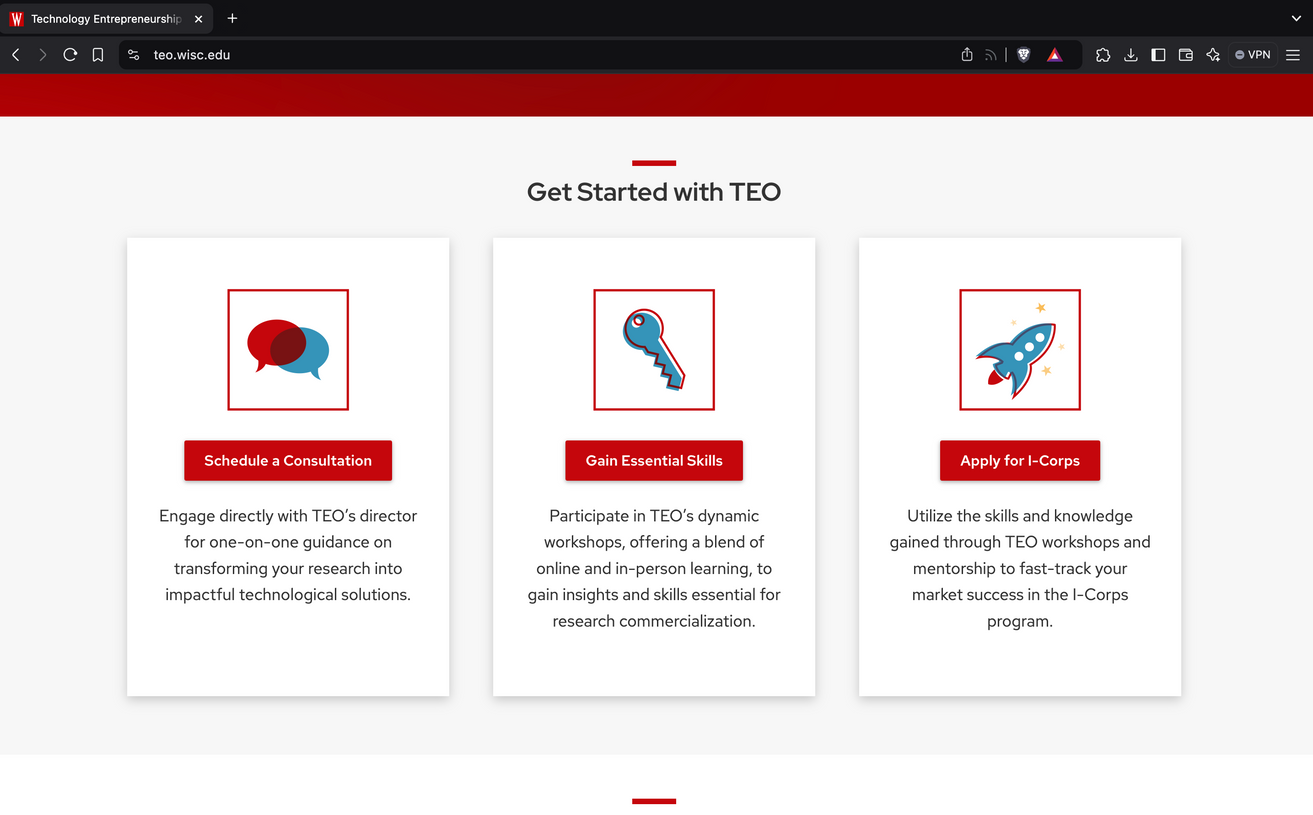
Visual Enhancements: To make the site more engaging, we explored adding a "What We Do" section with three-column cards to visually highlight TEO’s purpose and offerings. For additional visual consistency, we thought about using a wave pattern for TEO-related sections while alternating other sections with light grey or red backgrounds to align with the brand’s colors.
-
Humanizing the Team: To make the site feel more personal, we considered including headshots and bios of key team members on the "About" page. This could help build trust and foster a stronger connection with users.
Adrienne’s feedback played a key role in shaping these ideas. For instance, she emphasized creating distinct visual treatments for sections like "Innovation Beyond Labs" to ensure the design truly reflected TEO’s innovative and user-centered mission.
Wireframing: Visualising the solution
I created low-fidelity wireframes to bring the new structure to life. These wireframes explored:
-
CTA Placement: Highlighting actionable buttons above the fold.
-
Content Hierarchy: Ensuring key information was easy to find.
-
Visual Flow: Balancing text and imagery to maintain user focus.
Adrienne provided valuable feedback during this phase,
suggesting adjustments to content hierarchy and emphasizing the importance of clear visual anchors.
The Final System
Introduction:
Bridging Innovation & Entrepreneuship
In 2023, as a Creative Communications Intern at UW-Madison, I led the redesign of the Technology Entrepreneurship Office (TEO) website. Guided by Adrienne Nienow, Bonnie Bachman, and Emma Uren, the project aimed to improve the site’s usability and visual appeal.
Despite TEO’s critical role in fostering innovation and connecting users with NSF I-Corps and entrepreneurial resources, its website suffered from low engagement and unclear navigation. My goal was to create a user-focused platform that empowered innovators through intuitive design and clear pathways.
Evaluation & Research
Through a UX audit and stakeholder discussions, I identified several critical pain points that shaped the redesign strategy:
-
Misaligned Content: Key sections like "What We Do" and "Innovation Beyond Labs" were buried below ineffective CTAs, making it difficult for users to understand TEO’s purpose.
-
Confusing Navigation: Users struggled to find relevant programs and resources, lacking clear next steps or contextual guidance.
-
Visual Disengagement: Outdated aesthetics and minimal visuals failed to inspire or reflect TEO’s innovative mission.
-
Copy Clarity: The website’s content was not user-focused. CTAs lacked context (e.g., "Submit I-Corp form" was unclear), and descriptions didn’t fully explain the value or process behind key actions.
Copywriting: Crafting Words that Resonate
Recognizing that content was as critical as design, I worked closely with Adrienne to refine the site’s messaging. This was one of my first experiences with professional copywriting, and it took time to figure out how to effectively craft language that was both engaging and actionable. However, I was able to draw on the marketing knowledge I gained during my MBA, which helped me navigate this new challenge.
-
CTAs: One of the key changes was rephrasing "Submit I-Corp Form" to "Join I-Corp: Innovate with Us," making the action more inviting and user-focused.
-
Program Pages: Text-heavy sections were simplified with concise descriptions and infographics, providing step-by-step guidance that was easier to understand and act on.
-
Tagline: Adrienne contributed the impactful tagline, "From Ideas to Startups to Scale Up," which perfectly encapsulated TEO’s mission. This tagline became a central element of the site’s messaging, aligning with the user journey and TEO’s value proposition.


